OVERVIEW
Project Background
I joined Mantra DAO as the first dedicated UX/UI designer. The product had already been built, but the interface was confusing and the flows lacked structure — especially for users who were new to crypto. Staking, token swaps, and wallet management are genuinely complex actions. The interface wasn't helping anyone understand what they were doing or why.
Challenge and solution
- This was my first time working on a cryptocurrency product, so I had to quickly ramp up my understanding of DeFi, tokenomics, wallets, and web3 principles.
- As the only designer on the team (with no senior UX/UI or crypto mentor), I had to work very independently, researching, validating, and designing without direct guidance.
APPROACH
Self-education
I spent time studying competitor apps, reading DeFi user forums to understand where people got stuck, and mapping the mental model of a first-time crypto user. The core insight was simple: crypto interfaces typically design for power users and leave everyone else behind. That was the gap I was designing for.
User-Centred Flow
I mapped out a simplified user journey that walks users through complex actions like wallet connection, token swaps, and staking, without jargon or overload.
Interface Revamp
The wallet page had color confusion and unclear hierarchy, users couldn't tell at a glance what network they were on or what actions were available. I restructured the layout, highlighted the mainnet network clearly, and added the ability to switch networks without hunting through settings.
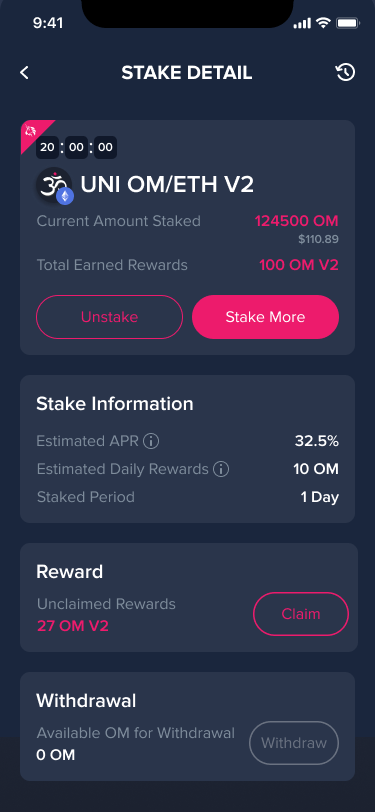
The staking page was the biggest problem. There was no way to distinguish between different asset types, no status indicators, and no categorization. Users had no idea what was staked, what was earning, or what had ended. I introduced filtering and sorting, clear status states, and visual separation between single assets and liquidity pool positions. For each staking state — active, countdown, ended, new pool, I designed a distinct layout so users always knew exactly where they stood.
The staking page was the biggest problem. There was no way to distinguish between different asset types, no status indicators, and no categorization. Users had no idea what was staked, what was earning, or what had ended. I introduced filtering and sorting, clear status states, and visual separation between single assets and liquidity pool positions. For each staking state — active, countdown, ended, new pool, I designed a distinct layout so users always knew exactly where they stood.
Wallet page

 Before
After
Before
After
Color confuse
Unclear hierarchy
No other mainnet network
Change mainnet network function
Highlight the mainnet network
Clear hierarchy
Staking page

 Before
 After
After
Color confuse
No categorize
No status
Pick a primary color
Highlight the staking tokens
Filter and Sorting
Single assets are distinguished from LP
Staking detail page with different status

 Staking Token with countdown
 Ended pool
 Non-Staking Token with new pool
Staking Naked Token with new pool
Non-Staking Token with new pool
Staking Naked Token with new pool
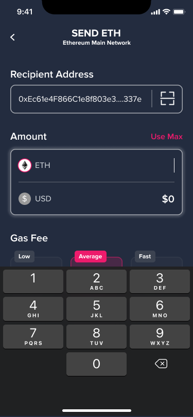
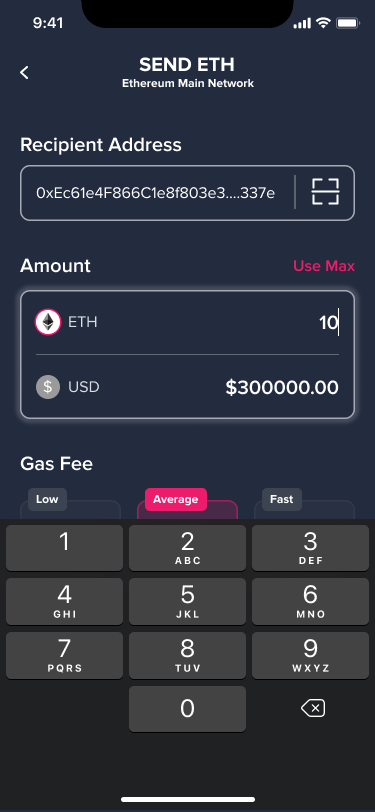
Cryptocurrency Converter
RESULTS
The redesign reduced visual and cognitive overload, particularly for users new to DeFi. The flows for staking and token swaps became clear enough that first-time users could complete their first transaction without needing external guidance. The design system I built gave the startup a foundation they could continue building on after I left.
Tools & Technologies
Figma for wireframing and prototyping
Miro for user journey mapping and brainstorming
InVision for interactive prototypes and stakeholder presentations
Miro for user journey mapping and brainstorming
InVision for interactive prototypes and stakeholder presentations